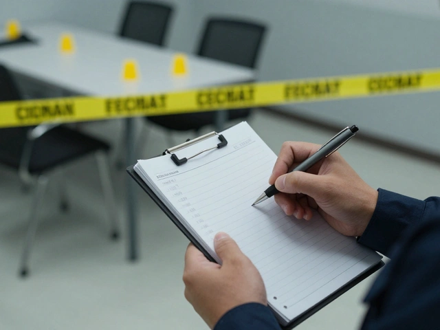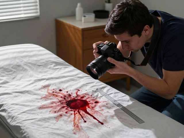
A single typo on a date or a misplaced arrow on a chart can destroy a legal team's credibility in seconds. In a high-stakes trial, jurors don't just listen to your argument; they look for reasons to doubt it. When you present complex data through narrative alone, you're asking the jury to do the heavy lifting-mentally organizing dates, connecting evidence, and building a timeline in their heads. Most people aren't good at that, and when they get confused, they get anxious. Anxious jurors are far less likely to be persuaded.
The solution is forensic reporting is the process of translating complex technical and factual data into a clear, evidence-based format suitable for legal proceedings. By turning a dry set of facts into trial graphics, you stop asking the jury to imagine the story and start showing it to them. Whether it's a detailed chronology of a breach of contract or a graph showing a spike in chemical levels, the goal is to create a visual roadmap that makes your conclusion feel inevitable.
The Psychology of the Courtroom Timeline
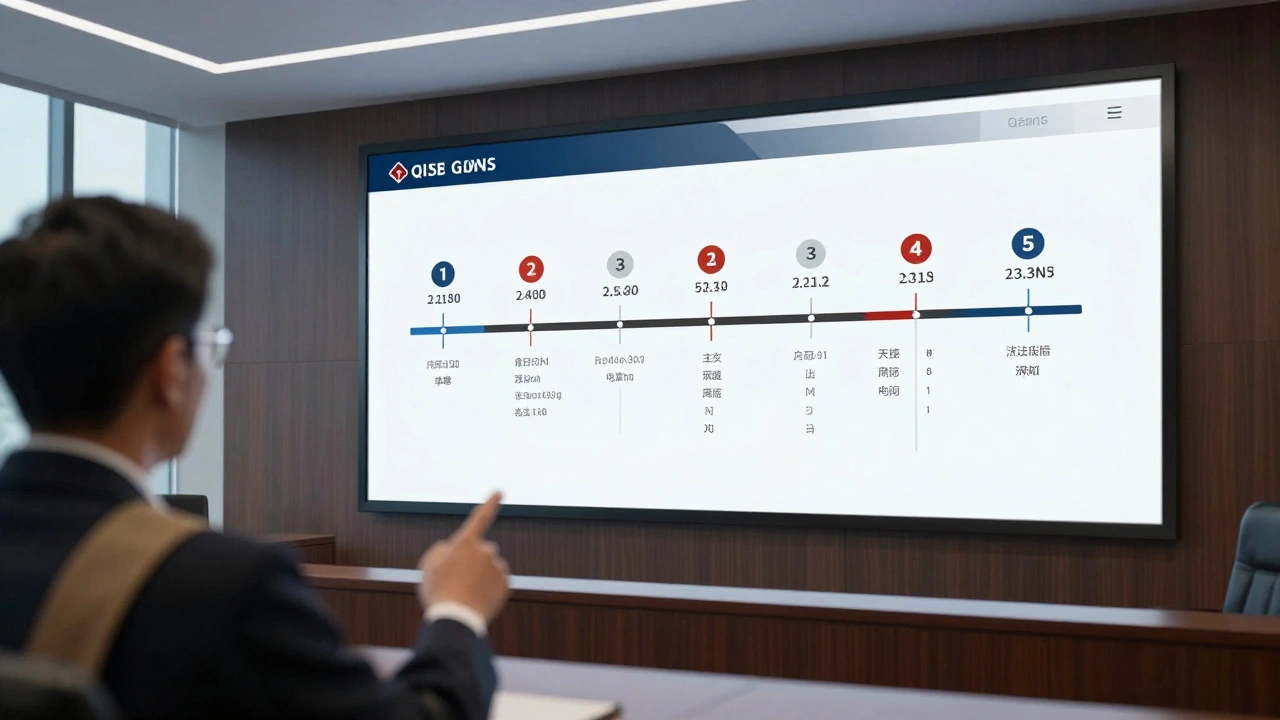
Timelines are more than just lists of dates; they are narrative threads. A well-constructed Timeline Graphic is a visual tool that relieves juror anxiety by providing a structured path through the case. Instead of struggling to remember if the email was sent before or after the contract was signed, the juror can simply look at the screen. This cognitive ease allows them to focus on the *meaning* of the events rather than the sequence.
To make a timeline actually persuade, you need a strict visual hierarchy. Not every single event is equally important. If you treat every date with the same font size and color, you create "visual noise" that obscures your main point. Instead, use a tiered approach:
- Primary Events: These are your case-killers. Use larger text, bold colors, and prominent markers to highlight the major milestones.
- Secondary Events: These provide necessary context. Use a complementary, more muted style.
- Supporting Details: These are the a-ha moments-specific document references or witness statements that anchor the event in reality.
- Annotations: Short, punchy explanations that tell the jury *why* this specific date matters.
Designing for Clarity and Credibility
A visual that looks "homemade" can subconsciously signal a lack of professionalism or rigor. However, over-designing can make a graphic look like a marketing brochure, which can trigger skepticism. The sweet spot is a clean, professional look that emphasizes accuracy over aesthetics.
Color should be used as a functional tool, not as decoration. A common and effective strategy is to assign specific colors to different parties-for example, blue for the plaintiff and green for the defendant. Use a high-contrast color like red exclusively for the "critical incident," such as the moment of impact in a car accident or the exact second a security breach occurred. This creates an immediate visual anchor for the jury.
| Element | Poor Approach | Persuasive Approach |
|---|---|---|
| Date Format | Varying formats (e.g., 1/2/24 and Jan 2nd) | Consistent, unambiguous formatting throughout |
| Text Volume | Paragraphs of explanation on the slide | Short labels with linked evidence references |
| Flow | Jumping back and forth in time | Strict linear progression with branching for overlaps |
| Whitespace | Cramming every single fact onto one board | Generous margins to prevent cognitive overload |
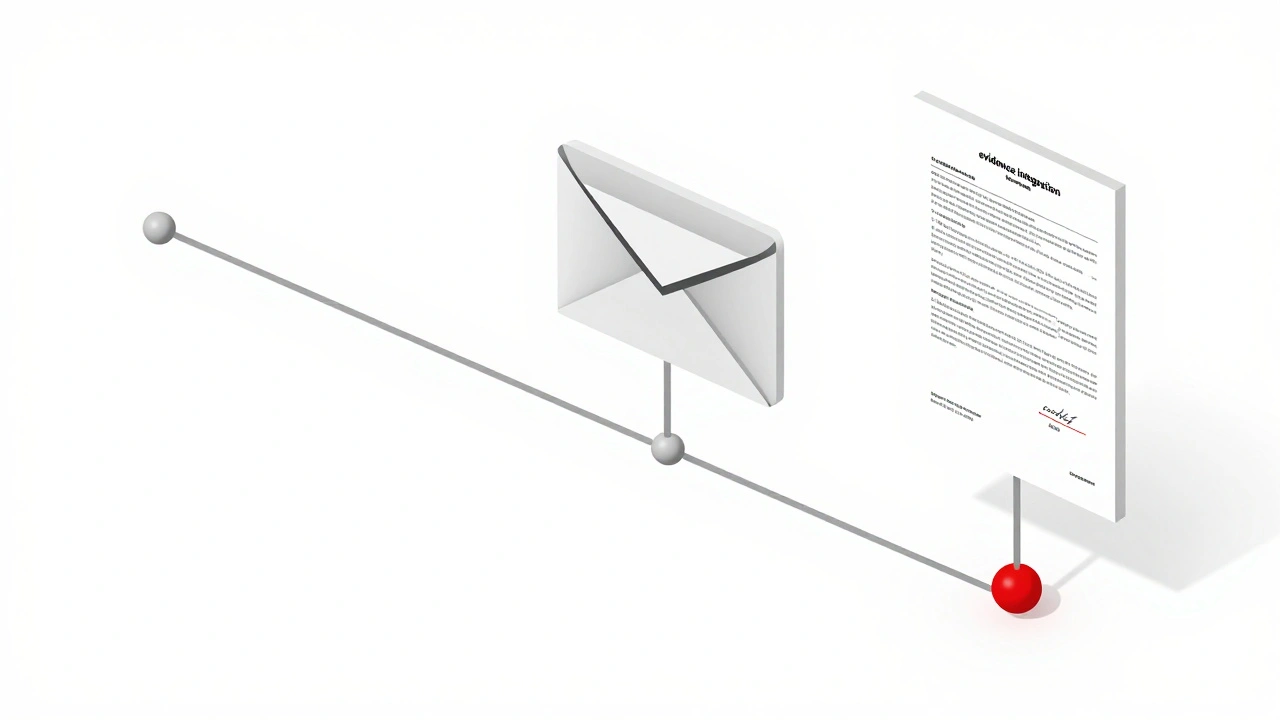
Connecting Visuals to Hard Evidence
A timeline that is just a series of assertions is just a story. A timeline that is linked to documents is a fact. To build an ironclad case, you must integrate Evidence Integration directly into your visuals. This means that if your timeline shows a breach of contract on March 15, the visual should either include a thumbnail of the email proving that breach or a clear reference to "Exhibit B, Page 4."
When you link a visual event to a physical piece of evidence, you transform the graphic from a subjective narrative into a factual record. This is especially powerful when dealing with "silence." For example, if there is a six-month gap where two parties stopped communicating, don't just leave a blank space. Visually highlight that gap. Use a bracket or a faded area to show the passage of time, and label it. Often, what *didn't* happen is just as important as what did.
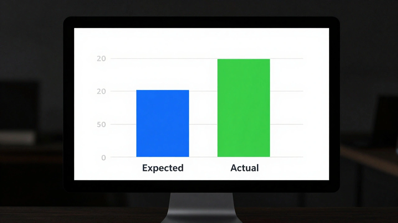
Strategic Use of Graphs and Data Charts
While timelines handle the "when," graphs handle the "how much" or "how often." In legal proceedings, the goal of a graph isn't to provide a comprehensive statistical analysis, but to make a specific point clear. If you are presenting data on financial loss or toxic exposure, a complex spreadsheet will lose the jury immediately. You need a visual that isolates the key variable.
The most effective Trial Graphics focus on comparison. Instead of showing one set of numbers, show the "expected" vs. the "actual." For instance, if a witness testified that a machine was maintained monthly, but your data shows it was only serviced once a year, a simple bar chart showing the gap between the claim and the reality is far more persuasive than reading the maintenance log aloud for twenty minutes.
Keep these graphs minimalist. Remove unnecessary grid lines, avoid 3D effects (which can distort data perception), and use clear, large labels. The jury should be able to understand the "takeaway" of the graph within five seconds of seeing it. If it takes longer than that, the graph is too complex.
Execution and Courtroom Reliability
The best visual in the world is useless if it doesn't load on the courtroom monitor or if the font is too small for the jury to read from their seats. Technical failure during a presentation creates a momentum killer and makes the presenting team look disorganized.
Professional execution requires a few non-negotiable steps:
- Distance Testing: Print your visuals at full size and stand 20 feet back. If you can't easily read the dates and labels, increase the font size.
- Hardware Verification: Test your files on the actual hardware being used in the courtroom. Don't assume that a PDF on your Mac will behave the same way on a government-issued Windows tablet.
- Synchronization: Ensure your video clips and transcripts are time-coded. When you reference a specific line in a deposition, the visual should jump exactly to that moment, not leave the jury waiting while you scrub through a video bar.
- Style Guides: Use a consistent set of colors and arrows for every single exhibit. If a blue arrow means "money flow" on one chart, it must mean "money flow" on every other chart in the trial.
By treating your visuals as an integrated system rather than a collection of random slides, you create a cohesive narrative. You aren't just presenting evidence; you are building a mental model for the jury that aligns perfectly with your theory of the case.
How do I handle conflicting dates from opposing counsel?
Instead of ignoring the conflict, visualize it. Create a "comparison timeline" where your documented facts are plotted against the opposing party's claims. When the jury sees a documented email on one line and a contradictory witness statement on the line below it, the visual contrast creates an immediate credibility gap that is much more powerful than simply pointing out the lie during cross-examination.
What is the best way to present a massive amount of data without overwhelming the jury?
Use a "layered" approach. Start with a high-level summary visual (the 30,000-foot view) that shows the general arc of the case. Once the jury understands the big picture, you can zoom in on specific "detail views" or "deep-dive" charts for individual events. This prevents cognitive overload by giving the jury a frame of reference before hitting them with the granular data.
Can I use icons or symbols in my courtroom graphics?
Yes, but keep them intuitive. Use symbols that require zero explanation-like a telephone icon for a call or an envelope for an email. Avoid abstract icons that might be misinterpreted. The goal is to reduce the amount of text the jury has to read, allowing them to process the information faster.
Should I include every single event in a timeline, even the boring ones?
Generally, no. A persuasive timeline is not a diary; it's a strategic narrative. Include every event that is *legally significant* or necessary to establish the sequence. However, be careful not to omit events that the opposing side will likely bring up. It is better to include a neutral event and neutralize its impact than to leave it out and appear as if you are hiding evidence.
What's the biggest mistake people make with trial graphs?
The biggest mistake is using "chart junk"-unnecessary 3D effects, distracting backgrounds, or overly complex legends. These elements distract the jury from the data. A simple, clean 2D bar or line chart is almost always more persuasive because it presents the data honestly and clearly, which builds trust with the viewer.